| View previous topic :: View next topic |
| Author |
Message |
Jezza 

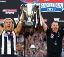
2023 PREMIERS!
Joined: 06 Sep 2010
Location: Ponsford End
|
| Post subject: |  |
|
Quality work Raw Hammer and thanks for uploading the step-by-step process of the logo you've designed.
I like the fact that your logo says 'Collingwood Football Club' instead of 'Collingwood' and the design of the Magpie looks bold and aggressive which is excellent. The link to Victoria Park is nice.
I must admit I'm not a fan of the secondary logo like others here, part of it being I'm largely unfamiliar with it as I don't follow US sports, but nevertheless I can your understand the reasoning behind the conception of it.
_________________
| 1902 | 1903 | 1910 | 1917 | 1919 | 1927 | 1928 | 1929 | 1930 | 1935 | 1936 | 1953 | 1958 | 1990 | 2010 | 2023 | |
|
|
|
 |
blakis
Joined: 05 Oct 2009
|
| Post subject: | |
|
Great job. I think the first design is a great contemporary take.
The magpie in particular is a great improvement.
I wasn't really sold on the second design until I saw it on the apparel where you can see it's intention.
The only bit of constructive feedback is that the logo being so close to a 1:1 ratio in size limits it's use in online media. I say that from experience with my own business where my logo is 1:1 and the troubles I've faced in designing websites and marketing material as a result.
Apart from that I think you've done an amazing job, thanks for sharing.
|
|
|
|
|
Damien 
Me Noah & Flynn @ the G
Joined: 21 Jan 1999
Location: Croydon Vic
|
| Post subject: | |
|
I think the primary logo is genuinely good and modern. The big C makes sense. If the rumoured logo in the other thread is fair dinkum then yours kills it. Put up a poll between the two on here and get some free market research for the club. They definitely take notice of what we say here so it might send a good Message.
_________________
'Collingwood are the Bradmans of Football'
The Herald - 1930 |
|
|
|
|
The Boy Who Cried Wolf

Joined: 26 Sep 2013
Location: We prefer free speech - you know it's right
|
| Post subject: | |
|
When it comes to all this stuff, I personally believe we should stick as close to tradition as possible.
_________________
All Aboard!! Choo Choo!!! |
|
|
|
|
The Logologist
Joined: 02 Oct 2017
|
| Post subject: | |
|
Cheers. If I have time, I'll upload the full 40-page proposal.
I was tossing and turning whether to drip feed the logos (primary logo first), then secondary logos, as I was certain there's by a little apprehension to such secondary brand marks. However, I thought I'd just drop it all in one hit.
Like I said, secondary and alternative logos are merely for merchandise and apparel. I think if we were ever to see it up close and personal it'd be something we'd want to wear. But I understand the apprehension of people not used to this type of thing in Australian sports.
It's pretty much clear that the club is about to release a new logo for 2018, which stings a little after all the after-hours work that has gone in to developing this proposal. I might simply develop my own unofficial merchandise instead. Watch this space...
|
|
|
|
|
mudlark

Joined: 19 Mar 2002
Location: Maroochydore Qld
|
| Post subject: | |
|
| The Logologist wrote: | | Here is an even more abridged version to ensure it could be uploaded ... part 2 (the apparel examples slides) will be posted shortly. |
I like the hard look of the magpie and I'm not trying to be demeaning in any way here but the thin white margin around the bird, in particular, it's head tends to take the sharpness away.just my thought ,but it does look meaner.
|
|
|
|
|
The Logologist
Joined: 02 Oct 2017
|
| Post subject: | |
|
| Not a problem. Always appreciate constructive criticism and feedback. There are still a few minor tweaks I'm looking at, but I'm not an artist and my design crew have been too busy to do thy bidding.
|
|
|
|
|
Woods Of Ypres
Joined: 27 May 2003
Location: Yugoslavia
|
| Post subject: | |
|
| first logo looks pretty cool, but i think the magpie is a little rounded. Not sure if I like the 'C' in the logo, borrows too heavily from MLB Logos. Still, would take this logo ahead of the existing.
|
|
|
|
|
cfc2009-10-11-12
Joined: 26 Aug 2005
|
| Post subject: | |
|
| The Logologist wrote: | | Here is an even more abridged version to ensure it could be uploaded ... part 2 (the apparel examples slides) will be posted shortly. |
Good job, Logologist!
I quite like the Magpie! If we ever changed, I've recently liked the modern changes to the logo North Melbourne, Richmond and Footscray made. A fresh, almost animated emblem.
I didn't fancy the C bordering the logo but the Magpie is phenomenal. Open minded about the stripes in the background.
_________________
Daicos, this is when he's at his best, the MAAASSSTTTTTEEERRR!!! |
|
|
|
|
The Logologist
Joined: 02 Oct 2017
|
| Post subject: | |
|
| Woods Of Ypres wrote: | | first logo looks pretty cool, but i think the magpie is a little rounded. Not sure if I like the 'C' in the logo, borrows too heavily from MLB Logos. Still, would take this logo ahead of the existing. |
Cheers. The Magpie could definitely be 'hardened' to perhaps be a little more imposing, I'm with you on that (although not to the extent of the current one, which looks deformed). Unfortunately I'm not an artist, so can't make any changes until I get professional assistance to complete the final hi-res versions.
I personally like the C because a) it's essentially the current logo ring turned on its side, and b) it's the shape of Victoria Park. If it's MLB-ish so be it. But that's just me.
|
|
|
|
|
The Logologist
Joined: 02 Oct 2017
|
| Post subject: | |
|
| cfc2009-10-11-12 wrote: | | The Logologist wrote: | | Here is an even more abridged version to ensure it could be uploaded ... part 2 (the apparel examples slides) will be posted shortly. |
Good job, Logologist!
I quite like the Magpie! If we ever changed, I've recently liked the modern changes to the logo North Melbourne, Richmond and Footscray made. A fresh, almost animated emblem.
I didn't fancy the C bordering the logo but the Magpie is phenomenal. Open minded about the stripes in the background. |
I'm a fan of the Bulldogs and Tigers logo too.
Not so much the North logo. To me it looks like a naked man-roo peering above an oversized NORTH title. I think it misses the mark. The kangaroo is such an imposing animal...and the focus only on the head? Opportunity missed.
Last edited by The Logologist on Mon Oct 02, 2017 10:29 pm; edited 1 time in total |
|
|
|
|
swoop42 
Whatcha gonna do when he comes for you?
Joined: 02 Aug 2008
Location: The 18
|
|
|
|
|
The Logologist
Joined: 02 Oct 2017
|
| Post subject: | |
|
| swoop42 wrote: | Not for me I'm afraid.
The lines of the magpie aren't sharp and sleek enough and it looks to much like a cartoon.
Personally I'd rather just the simple addition of another magpie to an already classy looking emblem. |
No worries. A harder edge to the Magpie is under consideration.
Each to their own though, although I personally didn't my like the current logo (my God, those flags!)
|
|
|
|
|
Luigitheunbelievable

Joined: 09 Aug 2017
Location: Ringwood. Victoria. Australia
|
| Post subject: | |
|
Hi Folks.
I am very old fashioned, I love the current logo. Its instantly recognisable to everyone.
Have you considered that, to the opposition, we are just a bunch of "Cs" anyway.
I think Carlton people would have a big laugh at that.
I reckon the magpie in your logo looks too much like a bower bird.
Sorry, please don't be offended, that's just my thoughts.
Regards.
_________________
Side by side we stick together. |
|
|
|
|
Damien
Me Noah & Flynn @ the G
Joined: 21 Jan 1999
Location: Croydon Vic
|
| Post subject: | |
|
Check out Instagram this morning. Are we becoming Carlton?
_________________
'Collingwood are the Bradmans of Football'
The Herald - 1930 |
|
|
|
|
|