| View previous topic :: View next topic |
| Author |
Message |
joffa corfe

PREMIERS 2010

Joined: 13 Nov 2003
|
| Post subject: Breaking with Tradition |  |
|
Our two magpie emblem celebrating 125 years is fantastic...If it did happen and i certainly would have no trouble with it would be thrilled with a permanent emblem featuring two magpies:)
Thoughts ?
_________________
Football is Greatness
http://youtu.be/tJwoKbPOsQE |
|
|
|
 |
Jezza 
2023 PREMIERS!
Joined: 06 Sep 2010
Location: Ponsford End
|
| Post subject: | |
|
As a one-off year like next year I'm happy with it, otherwise I wouldn't want it to be a permanent fixture beyond 2017.
Sorry to burst your bubble, Joffa.
_________________
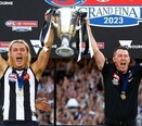
| 1902 | 1903 | 1910 | 1917 | 1919 | 1927 | 1928 | 1929 | 1930 | 1935 | 1936 | 1953 | 1958 | 1990 | 2010 | 2023 | |
|
|
|
|
Raw Hammer

Joined: 11 Sep 2008
Location: The Gutter
|
| Post subject: | |
|
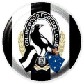
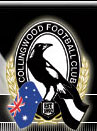
Our current emblem / logo is terrible. Possibly the worst in the league.
A horizontal striped black and white flag? An Australian flag? A weird vertical oval? It's so '90s. This is a good start for a logo change (albeit with just one Magpie). I'm in the process of redesigning our emblem with a designer to get with 'modern' times. Let's face it, our logo looks like crap on apparel. Drop everything but a proud, updated Magpie. More to come...
_________________
Est. 2002 |
|
|
|
|
Cam 
Nick's BB Member #166

Joined: 10 May 2002
Location: Springvale
|
| Post subject: | |
|
wow I love our current logo and think its streets ahead of most of the other teams.
whilst I like the new 125 one it does seem to be missing something on the black and white stripes part. seems a bit bare there. prefer the current one.
_________________
Get back on top. |
|
|
|
|
Bucks5
Nicky D - Parting the red sea
Joined: 23 Mar 2002
|
| Post subject: | |
|
The only issue I have with the current emblem is the way the black and white flag looks like an extension of the magpie's tail.
I much preferred it when the Australian flag was on the right. It is a shame that design breaches flag bearing protocol or etiquette.
_________________
How would Siri know when to answer "Hey Siri" unless it is listening in to everything you say? |
|
|
|
|
stui magpie 
Prepare for the worst, hope for the best.

Joined: 03 May 2005
Location: In flagrante delicto
|
| Post subject: | |
|
I like our current one. I could do without the Australian flag in there as I don't think it's necessary or adds any value and the little black and white flag has the stripes going the wrong way.
I also like the new one.
If you took the new one, added the oval arch with the Collingwood Football Cub written in it, I reckon you have a keeper to go forward with.
While the stylized cartoonish logos of some other clubs are OK, I like the classic look of ours.
_________________
Every dead body on Mt Everest was once a highly motivated person, so maybe just calm the **** down. |
|
|
|
|
Raw Hammer
Joined: 11 Sep 2008
Location: The Gutter
|
| Post subject: | |
|
You people are all crazy. Our logo sucks the big one. It should simply be a proud, solo magpie.
_________________
Est. 2002 |
|
|
|
|
Cam
Nick's BB Member #166
Joined: 10 May 2002
Location: Springvale
|
| Post subject: | |
|
| Raw Hammer wrote: | | You people are all crazy. Our logo sucks the big one. It should simply be a proud, solo magpie. |
Beauty is in the eye of the beholder RH. Some people are Justin Bieber fans for example. Taste is individual and not related to craziness. What you present are opinions not facts 
_________________
Get back on top. |
|
|
|
|
Raw Hammer
Joined: 11 Sep 2008
Location: The Gutter
|
| Post subject: | |
|
My opinion is fact 😉
_________________
Est. 2002 |
|
|
|
|
Piesnchess
piesnchess
Joined: 09 Jun 2008
|
| Post subject: | |
|
I used to love the ole logo, the one with the magpie perched on a fence post, reminds me of my two magpies I feed daily up here at Mt evelyn, they perch on our front fence, and I handfeed them, very tame, great part of bird life up here.
_________________
Poverty exists not because we cannot feed the poor, but because we cannot satisfy the rich.
Chess and Vodka are born brothers. - Russian proverb. |
|
|
|
|
STOKA35

Joined: 06 Feb 2003
Location: Mount Barker. South Australia
|
| Post subject: | |
|
| Raw Hammer wrote: | Our current emblem / logo is terrible. Possibly the worst in the league.
A horizontal striped black and white flag? An Australian flag? A weird vertical oval? It's so '90s. This is a good start for a logo change (albeit with just one Magpie). I'm in the process of redesigning our emblem with a designer to get with 'modern' times. Let's face it, our logo looks like crap on apparel. Drop everything but a proud, updated Magpie. More to come... |
Current logo is fine admit it would be hard for manufacturers that do embroidery though |
|
|
|
|
STOKA35
Joined: 06 Feb 2003
Location: Mount Barker. South Australia
|
| Post subject: | |
|
| Cam wrote: | wow I love our current logo and think its streets ahead of most of the other teams.
whilst I like the new 125 one it does seem to be missing something on the black and white stripes part. seems a bit bare there. prefer the current one. |
Agree with you about stripes area needs something in there or the black stripes need be black not faded |
|
|
|
|
Dave The Man 
Joined: 01 Apr 2005
Location: Someville, Victoria, Australia
|
| Post subject: | |
|
NO WAY!!!!!!!! We have 1 logo for 125 Years and Now Change? So why Bloody Change Perfection?
_________________
I am Da Man |
|
|
|
|
stui magpie
Prepare for the worst, hope for the best.
Joined: 03 May 2005
Location: In flagrante delicto
|
| Post subject: | |
|
| Dave The Man wrote: | | NO WAY!!!!!!!! We have 1 logo for 125 Years and Now Change? So why Bloody Change Perfection? |
Ehhh, it's changed at least twice already.
_________________
Every dead body on Mt Everest was once a highly motivated person, so maybe just calm the **** down. |
|
|
|
|
schuey07 
Joined: 05 Aug 2008
Location: Mount Waverley
|
| Post subject: | |
|
| I read somewhere that having one magpie is bad luck and that having two or more is actually better. I think we should stick with two and tweak the logo a little. |
|
|
|
|
|